Text Input
Designing a foundational input field to support new product UIs and scale the design system. Klue Design System ( aka Nectar) is a growing library of reusable components powering consistent product experiences across teams.
Why.
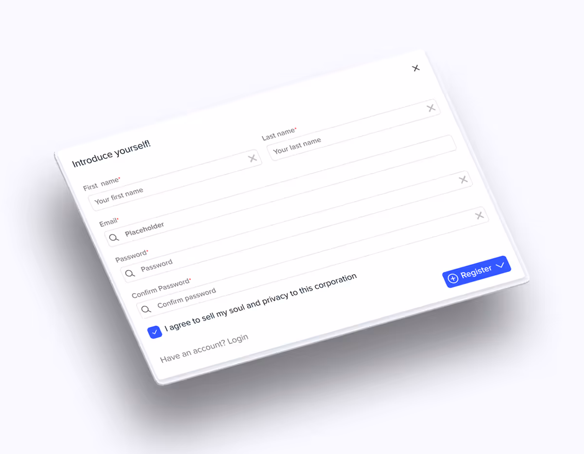
At the time, our design system didn’t include a standard Text Input component, and the need for one became clear as we introduced new modals and UI patterns across the product. Without a shared solution, teams had started building their own inputs, leading to inconsistent behavior, styling drift, and duplicated effort. To support new product work and reduce fragmentation, we needed a robust, accessible input field that could serve as a reliable building block across the platform.
What.
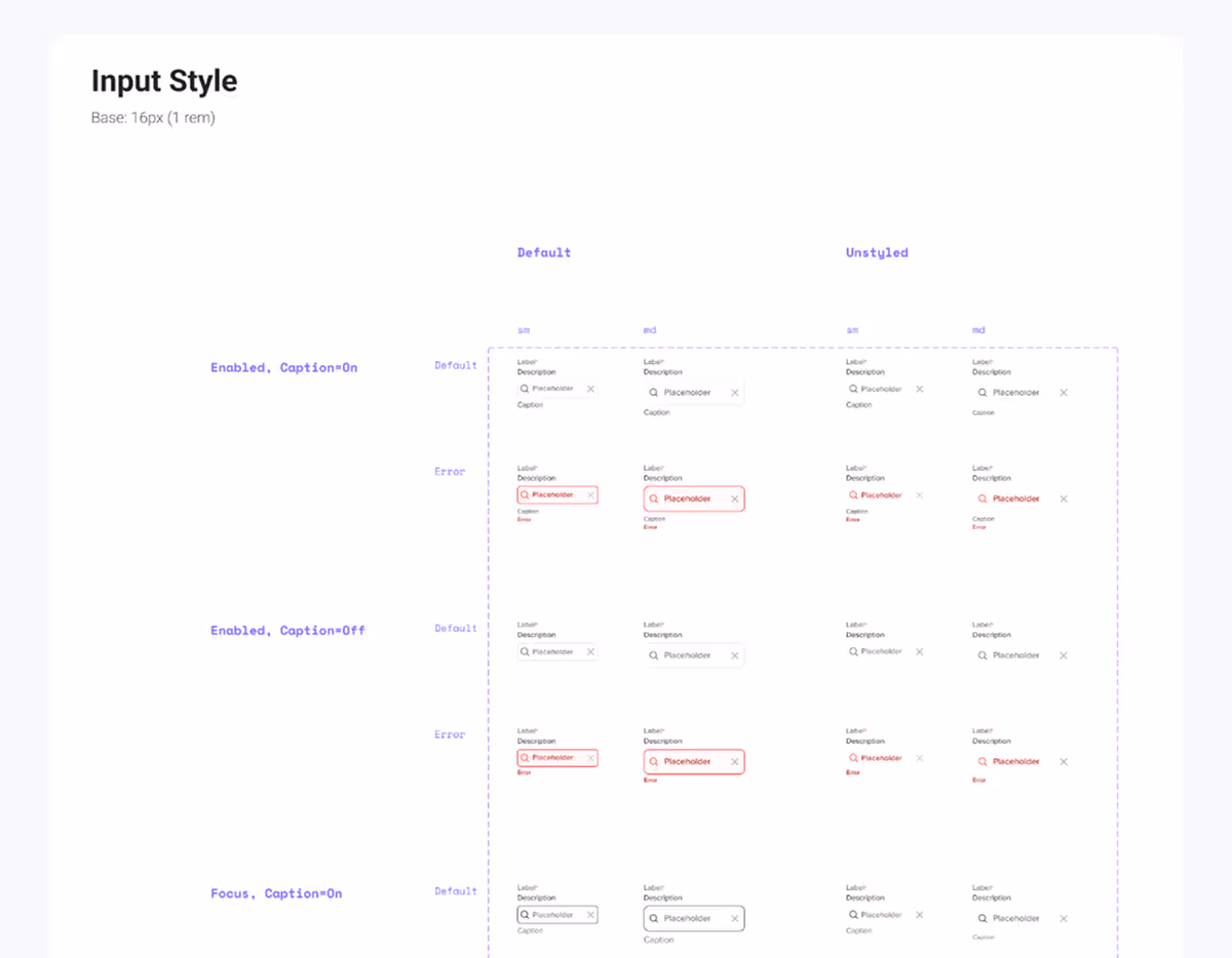
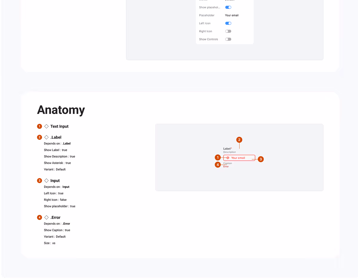
I began by reviewing upcoming product features to understand the range of input use cases we needed to support. From there, I worked closely with engineers and designers to define requirements and constraints: everything from validation states to icon support and accessibility. Along the way, I uncovered inconsistencies in sizing and spacing, especially when inputs appeared next to other elements like buttons or dropdowns. This led me to take the initiative to standardize our sizing scale across components, ensuring visual alignment and layout consistency throughout the product.
Impact.
The new Text Input component quickly became a foundational piece of our design system. It standardized core behaviors across the platform, from search bars to form fields. It ensured accessibility compliance by default. By reducing inconsistencies and edge-case bugs, it enabled teams to build faster and more confidently. The component also cut down on redundant design and dev work, making it easier for new team members to deliver polished, scalable interfaces right out of the gate.