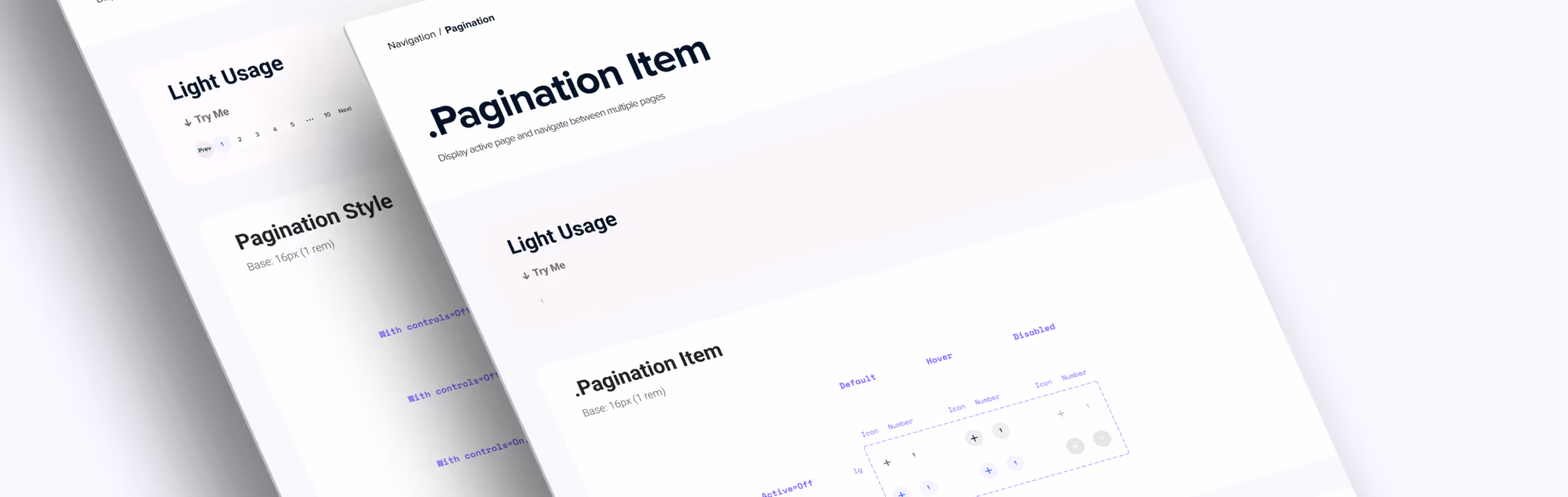
Pagination
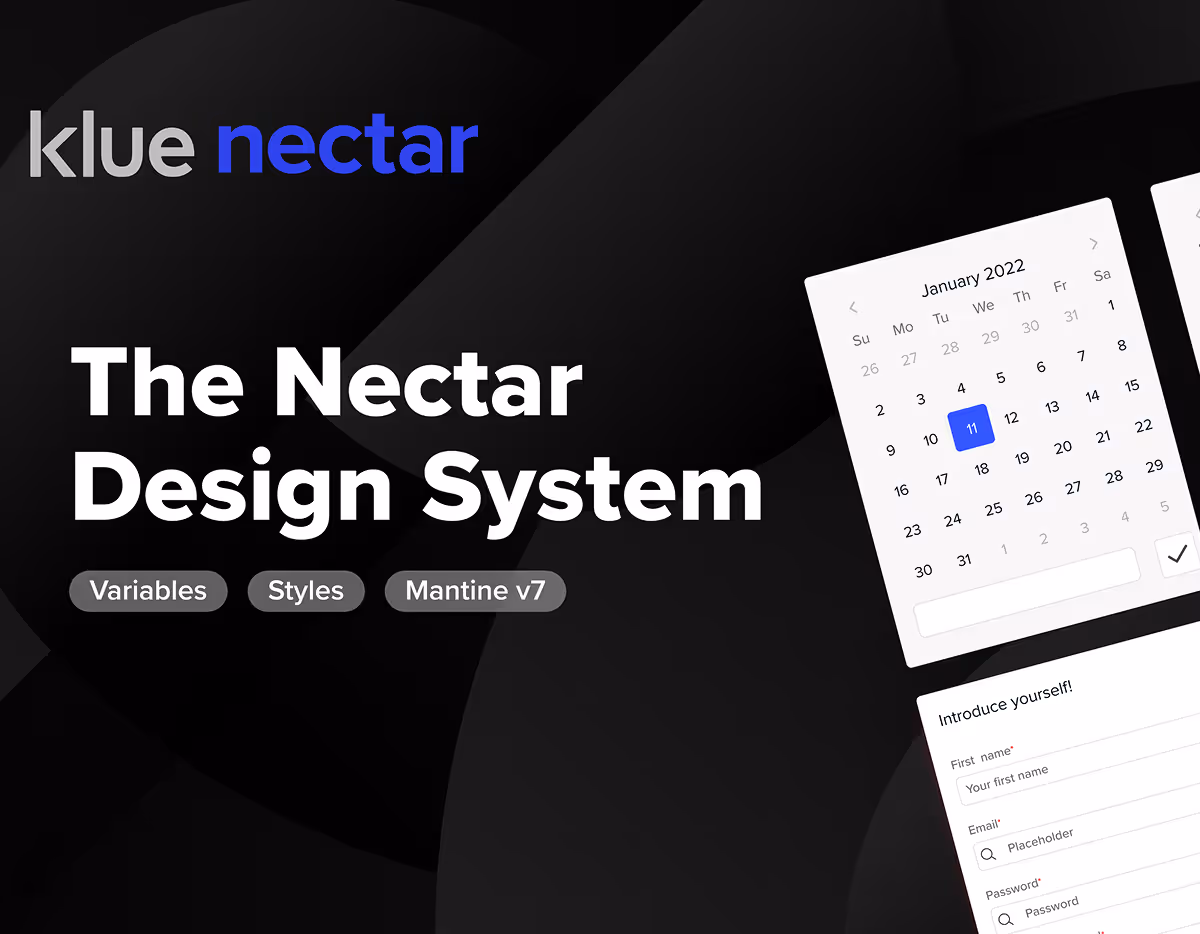
Designing a scalable, accessible pagination control to support growing data needs across the product. Klue Design System is a shared library of reusable UI components enabling consistent, efficient product development.
Why.
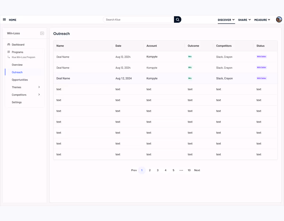
As our product evolved to handle larger datasets and more complex tables, and the absence of a standard Pagination component became a clear gap. Teams had started to implement their own ad hoc pagination controls, leading to inconsistent user experiences, duplicated effort, and accessibility issues. To maintain a cohesive UI and support new data-heavy features, we needed a reliable, accessible pagination solution that everyone could use.
What.
Starting from scratch, I researched common pagination patterns and best practices, focusing on clarity, accessibility, and adaptability to different contexts (tables, lists, cards). I collaborated with engineers to understand technical constraints and ensure the component would be easy to integrate.
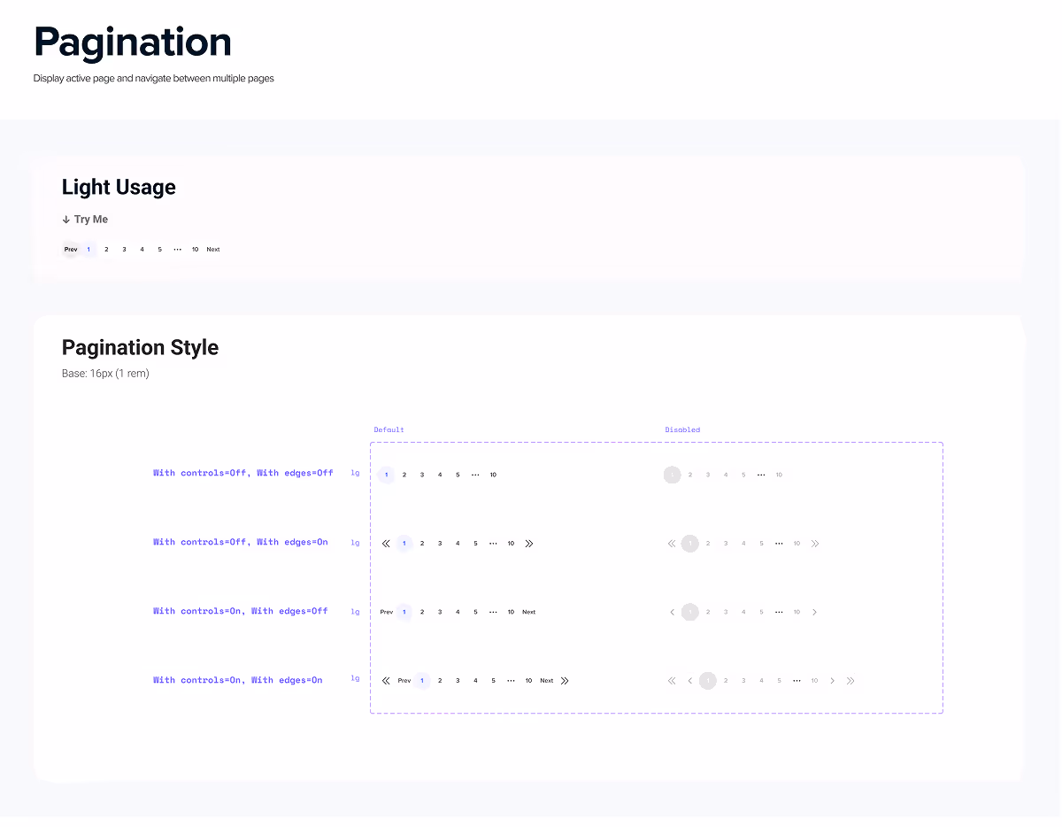
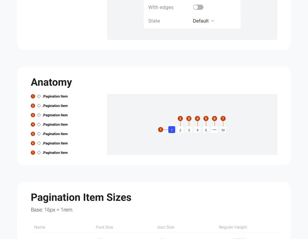
The design process involved:
- Defining core behaviors: page navigation, first/last/next/previous controls, and input for direct page jumps.
- Ensuring accessibility: keyboard navigation, clear focus states.
- Supporting flexibility: allowing for different sizes, responsive layouts, and optional elements (e.g., showing total results).
- Documenting usage: providing clear guidelines for when and how to use the component, with examples for various product contexts.
Impact.
The new Pagination component became a core building block in our design system. It helped teams ship data-heavy features faster, ensured accessibility out of the box, and brought consistency to pagination patterns across the platform. By replacing custom logic with a unified solution, we reduced maintenance and made it easier for new contributors to build scalable, production-ready interfaces.