Information Architecture Redesign
Redesigning navigation and information architecture to support growth, flexibility, and clarity across the
product. Win-Loss is a platform that helps companies uncover why they win and lose deals through interview analysis, tagging, and custom insights.
Win-Loss Research
Cross-functional stakeholders
Maze, Pendo, Fullstory
Slite, ChatGPT
Why.
Problem Context
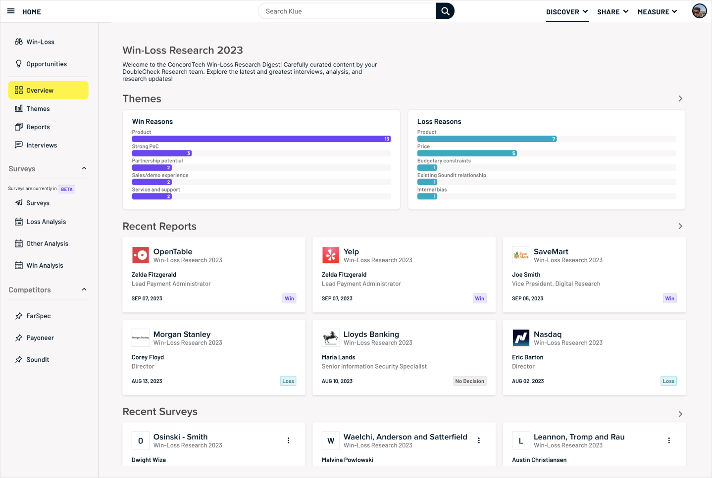
With about 70 customers on the Win-Loss MVP, FullStory showed users spending too much time clicking back and forth to piece together all the information about a single opportunity(deal). Dead-ends and disconnected pages left many giving up. We focused on improving IA to drive adoption and reduce curator workload.
What.
Partnering with PM, I led discovery through user interviews and both moderated and unmoderated card-sorting exercises in Maze. Across 12 sessions and 30 card sorts, we saw that user roles shaped how people expected to navigate: some wanted to start from research programs, while others looked for themes or reports. But the strongest trend, and one that aligned with the product vision , was organizing everything around an
opportunity (deal).

Execution
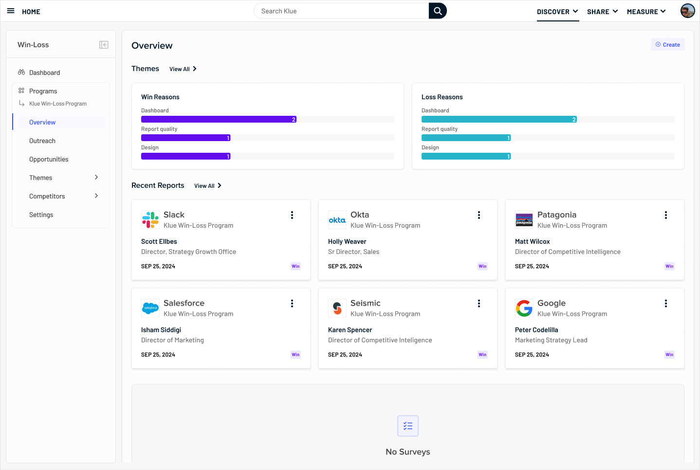
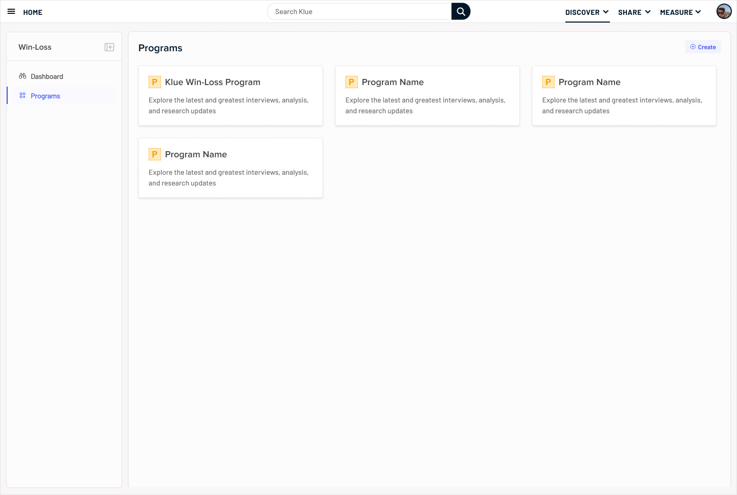
Based on this, we introduced a flexible, object-based model with core entities like Programs, Opportunities, Pages, and Reports. Instead of a tree navigation, where users follow one rigid hierarchy (e.g. Program → Page → Report), we shifted toward a graph model. In a graph, objects are interconnected, so an Opportunity could link directly to its interviews, tags, themes, and reports. This meant users didn’t need to retrace a single path, they could jump to whatever context they needed, depending on their role or task.
Constraints
A key constraint was that the platform’s foundation was built on Dovetail’s ( third-party) program structure. We couldn’t immediately break free of that model, but I used it as a stepping stone: reshaping the IA to better match user needs while balancing technical complexity with the long-term vision.
This meant keeping some legacy pages “as-is,” knowing we’d replace them with more scalable solutions in later iterations.
Impact.
Results
Users could finally see all related interviews, tags, and reports in one place, without bouncing between disconnected pages.
62%
Faster time to second deal related object
15
New reusable components created or modified