Global Navigation
Redesigning Klue’s navigation system to enhance usability, scalability, and cross-team efficiency across the platform. Klue is a competitive intelligence platform centralizing insights, win-loss analysis, and enablement tools for revenue and product teams.
Why.
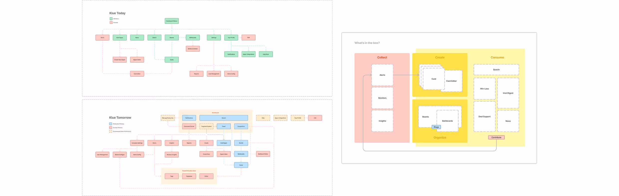
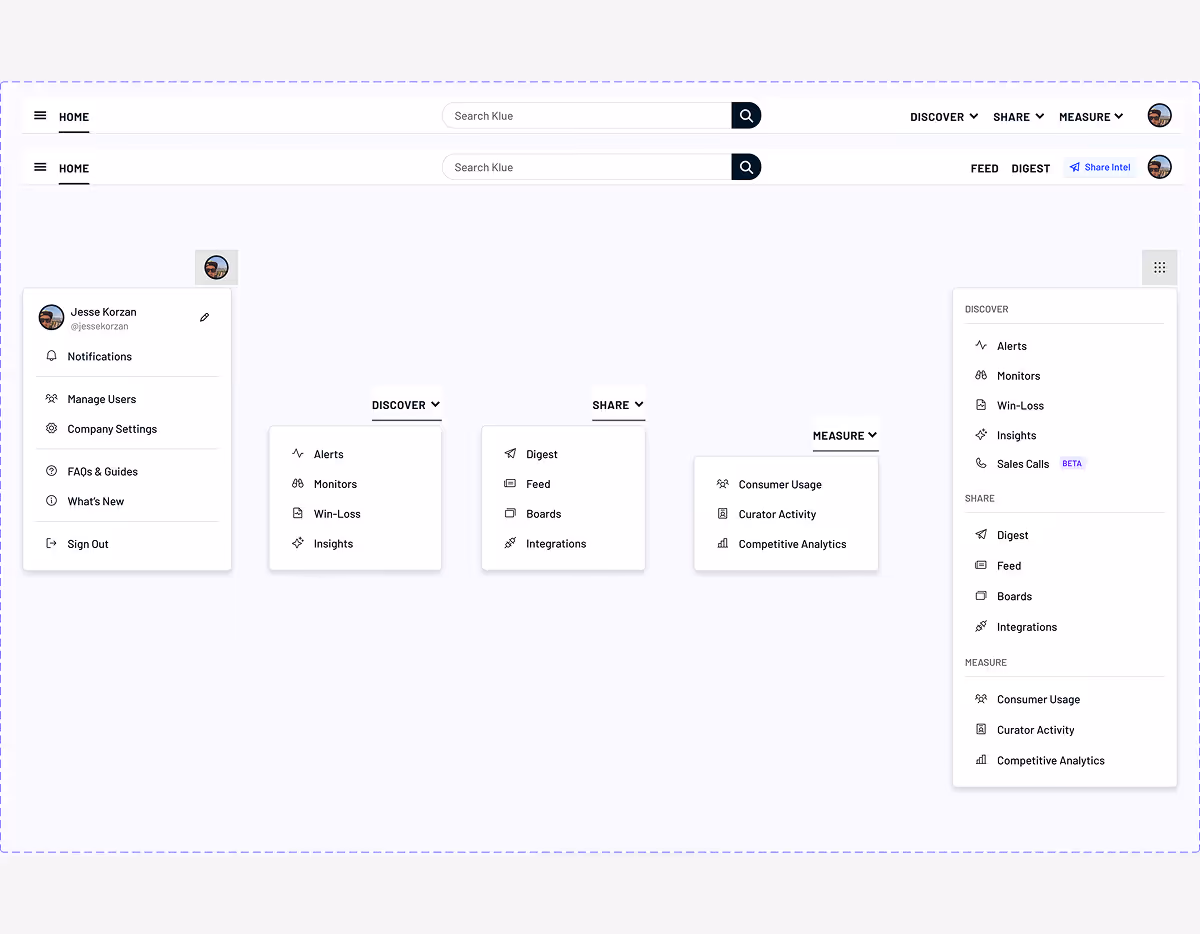
Klue’s old global navigation was inconsistent across modules, making it hard for users to find what they needed. As the platform grew, the nav couldn’t scale: new features felt bolted on, and the experience became fragmented. Users got lost, support tickets increased, and adoption of newer tools suffered. A unified, scalable navigation system was essential to move forward. The redesign was driven by a roadmap initiative to support the addition of a new product module. We needed a navigation system that could grow with the platform and deliver a more cohesive user experience.
What.
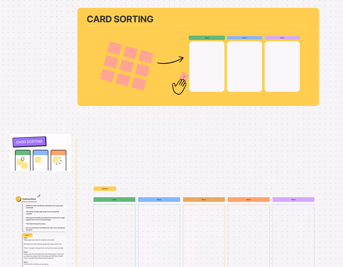
I started with a card sorting exercise to understand how users naturally grouped features and identified pain points in the old structure. Internally, I led stakeholder meetings to align on platform constraints and explore scalable solutions.
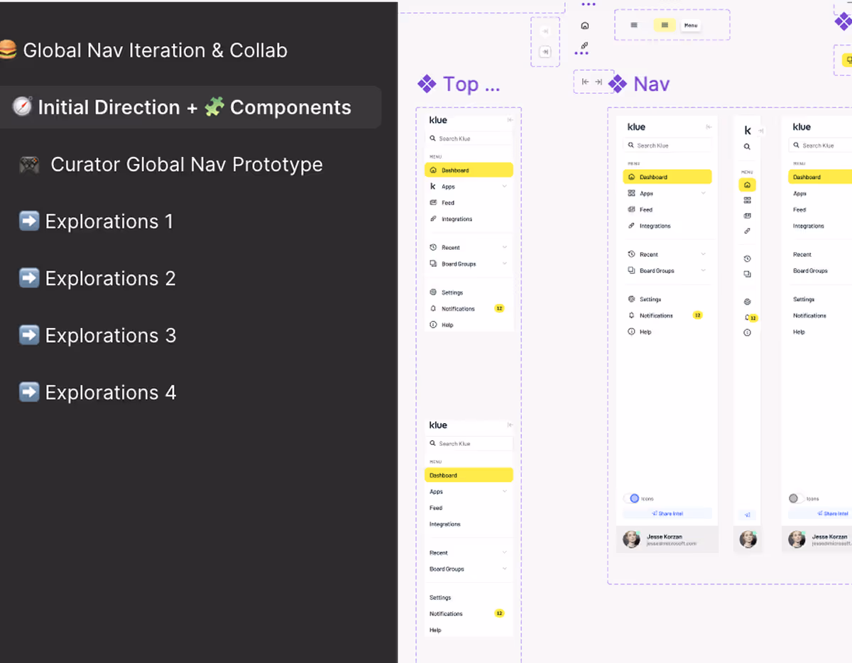
One of the biggest challenges was a lack of alignment across teams on how navigation should work. I addressed this by facilitating focused discussions early, using prototypes and diagrams to build shared understanding and drive decisions quickly.
To validate the new design, we tested it with users in Maze. This helped us confirm that the new structure was intuitive, and allowed us to refine the experience before launch.
Impact.
The redesigned navigation system improved usability, reduced confusion, and laid the foundation for future growth. Users could now move more confidently across modules, and internal teams had a scalable framework to build on.